Themes
This page will introduce you to any (not all) of the themes available in our current inventory and ready for use.
(1) Standard | (2) Minimal | Mobile First | (4) One Screen | (5) Solo Page | (6) Advance | (7) Big Picture | (8) Big Idea | (9) Custom Head | (10) Standard/Sections | (11) Custom Head 2 | (12) Big Picture Minimalist
What Theme Does Best Way Websites Use?
The Best Way Websites' website itself has been built using the Best Way Websites website builder (generator) and is maintained using the Best Way Websites CMS (Content Management System).
- It utilizes theme #6, which is the Best Way Websites Business Minimal Theme with Parallax Support.
- Tap here for theme #6.
Grand Concepts (Wireframe Images) Below
The images representing the themes below are SIMPLE ON PURPOSE. They represent only the "frame" of a website as it is seen in a desktop, laptop or high resolution pad.
Just like the construction of a home, your website will have finished walls, roof and rooms. All you are seeing in the images below is the most basic layout of your pages.
What About the Mobile View?
Due to the nature of the narrow screen width of mobile phones, your site will look just about the same on mobile phones regardless of the theme you choose for your website below. You will still have custom colors and images, of course.
Features
- 100% Responsive
- They automatically scale beautifully for any screen width.
- They automatically enable mobile navigation.
- They include optional "navicons" for mobile view.
- Easy Style Sheet (CSS) Editor
- Control background images and colors
- Control header, navigation and footer colors and actions
- Don't have to be a CSS expert to use
- Includes Custom CSS editing, too
- Custom Coding Accessible
- HTML
- PHP
- Site-wide Widgets
- Use our own widgets or those from 2nd parties
- Displays in same place on all pages
Custom Theme Requests
One of our existing themes will satisfy over 90% of our target. However, if you need something that we don't currently have in our inventory, submit a support ticket request and we'll get it done for you.
How to Submit a Support Ticket
You must first create your free account, then you will be able to create a support ticket from here: + Add Support Ticket.
(1) Standard | (2) Minimal | Mobile First | (4) One Screen | (5) Solo Page | (6) Advance | (7) Big Picture | (8) Big Idea | (9) Custom Head | (10) Standard/Sections | (11) Custom Head 2 | (12) Big Picture Minimalist
1) Our Business Standard Website Theme
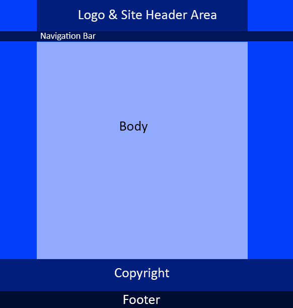
1) Business Standard Website Theme
The Business Standard Theme has been one of the most widely used of our themes, providing a generous space at the top of the site (header area) for branding. It is fully responsive to all screen widths. It will look great on any device. It provides a 200px tall main header image area for branding and loads an alternate 50px tall header that remains on top (along with navigation) when a user scrolls down.
For narrower screen widths (pads and mobiles) it automatically loads the mobile header (slide out menu, logo & action icons).
This theme requires 4 or 5 site-wide images. You will need to use our CMS to either create these images or upload your custom images for the following:
- Background (Optional)
- Full Size Header
- Short Header
- Mobile Logo
- Social / Favicons
CUSTOMIZATIONS: Easily change theme images, colors, backgrounds and more ...
Tap here to see theme #1 in action.
(1) Standard | (2) Minimal | Mobile First | (4) One Screen | (5) Solo Page | (6) Advance | (7) Big Picture | (8) Big Idea | (9) Custom Head | (10) Standard/Sections | (11) Custom Head 2 | (12) Big Picture Minimalist
2) Our Business Minimal Website Theme

2) Business Minimal Website Theme
The Business Minimal Theme is popular with those that don't want to take a lot of space for their branding (logo & header image at top of website). It is fully responsive to all screen widths. It will look great on any device.
The design facilitates the use of a small header that remains on top and left of the navigation bar. Your logo and navigation will stay on top as users scroll down the page. Keep the size of your logo between 125px X 50px and 188px X 50px.
For narrower screen widths (pads and mobiles) it automatically loads the mobile header (slide out menu, logo & action icons).
This theme requires 3 to 4 site-wide images. You will need to use our CMS to either create these images or upload your custom images for the following:
- Background (optinal)_
- Logo
- Mobile Logo
- Social / Favicons
CUSTOMIZATIONS: Easily change theme images, colors, backgrounds and more ...
Tap here to see theme #2 in action.
(1) Standard | (2) Minimal | Mobile First | (4) One Screen | (5) Solo Page | (6) Advance | (7) Big Picture | (8) Big Idea | (9) Custom Head | (10) Standard/Sections | (11) Custom Head 2 | (12) Big Picture Minimalist
3) Our Mobile First Website Theme
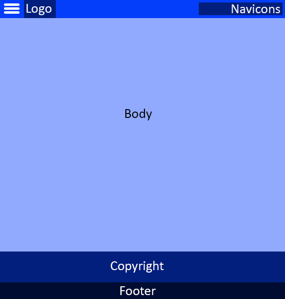
3) Mobile First Website Theme
The Mobile First Theme is popular for businesses whose target market accesses their website almost entirely via mobile devices, especially smart phones. It is fully responsive to all screen widths. It will look great on any device.
The design facilitates the use of a mobile navigation logo in the upper-left of all screens, followed by a small logo for the business. You may insert any of our system "navicons" which will embed in the upper-right part of the navigation bar. Your logo and navigation will stay on top as users scroll down the page.
There is room for up to 4 navicons in the browser bar for narrower screen widths (pads and mobiles).
This theme requires 2 to 3 site-wide images. You will need to use our CMS to either create these images or upload your custom images for the following:
- Background (optional)_
- Logo
- Social / Favicons
CUSTOMIZATIONS: Easily change theme images, colors, backgrounds and more ...
Tap here to see theme #3 in action.
(1) Standard | (2) Minimal | Mobile First | (4) One Screen | (5) Solo Page | (6) Advance | (7) Big Picture | (8) Big Idea | (9) Custom Head | (10) Standard/Sections | (11) Custom Head 2 | (12) Big Picture Minimalist
4) Our One Screen Website Theme
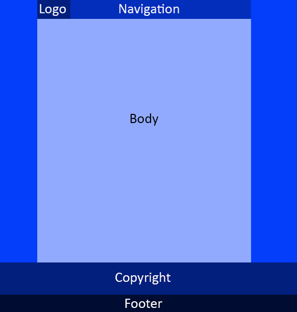
4) One Screen Website Theme
The One Screen Theme is fully responsive to all screen widths. It will look great on any device. It provides "tabs" for navigation at the top of the website, but instead of the tabs opening to new pages, they scroll down page to the tab section. Each section is customizable.
The design facilitates the use of a small header that remains on top and left of the navigation bar. Your logo and navigation will stay on top as users scroll down the page. Keep the size of your logo between 150px X 50px and 225px X 60px.
This theme is not intended for use with large content websites, but for basic informational sites. The main advantage is the end-user experience offered is that they can get to all content by simply scrolling down the page. If they use one of the navigational tabs (which always stay on top), their view will scroll down the page to the tabbed resource.
For narrower screen widths (pads and mobiles) it automatically loads the mobile header (slide out menu, logo & action icons).
This theme requires 3 to 4 site-wide images. You will need to use our CMS to either create these images or upload your custom images for the following:
- Background (optional)_
- Logo
- Mobile Logo
- Social / Favicons
Each tab has its own content area that you may style as you like:
- Background image & size
- Background color
- Font color
- Custom CSS styling
NOT Supported with this Theme:
- Left or Right Widgets
- Breadcrumbs
- Sub-navigation
CUSTOMIZATIONS: Easily change theme images, colors, backgrounds and more ...
Tap here to see theme #4 in action.
(1) Standard | (2) Minimal | Mobile First | (4) One Screen | (5) Solo Page | (6) Advance | (7) Big Picture | (8) Big Idea | (9) Custom Head | (10) Standard/Sections | (11) Custom Head 2 | (12) Big Picture Minimalist
5) Our Solo Page Website Theme
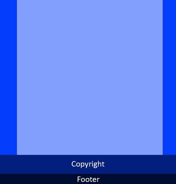
5) Solo Page Website Theme
The Solo Page Theme is just a true, single page website. It is fully responsive to all screen widths. It will look great on any device. There is no header or navigation required.
Popular as a "1 Page Wonder" website or a sales page site, the only way to navigate this site is to scroll down the page, or create internal navigation via internally anchored links.
This theme requires only one site-wide image - your Social-Favicons image. You will need to use our CMS to either create this image or upload your custom image for your social / favicon.
CUSTOMIZATIONS: Easily change theme image, colors, backgrounds and more ...
Tap here to see theme #5 in action.
(1) Standard | (2) Minimal | Mobile First | (4) One Screen | (5) Solo Page | (6) Advance | (7) Big Picture | (8) Big Idea | (9) Custom Head | (10) Standard/Sections | (11) Custom Head 2 | (12) Big Picture Minimalist
6) Our Business Minimal Advance Parallax Website Theme

6) Business Minimal Advance Parallax Website Theme
The Advance Theme is popular with those that don't want to take a lot of space for their branding (logo & header image at top of website) and ALSO want heading, text and image transitions with parallax.
Parallax functions are added by utilizing Section Start & Section Close from the CMS Toolbox.The container of the website will be full width or 100%. It is fully responsive to all screen widths. It will look great on any device.
You cannot use the left or right side widgets with this theme.
The design facilitates the use of a small header that remains on top and left of the navigation bar. Your logo and navigation will stay on top as users scroll down the page. Keep the size of your logo between 150px X 50px and 225px X 60px or your navigation bar will be forced to wrap to a line below.
For narrower screen widths (pads and mobiles) it automatically loads the mobile header (slide out menu, logo & action icons).
This theme requires 3 to 4 site-wide images. You will need to use our CMS to either create these images or upload your custom images for the following:
- Background (optinal)_
- Logo
- Mobile Logo
- Social / Favicons
CUSTOMIZATIONS: Easily change theme images, colors, backgrounds and more ...
Tap here to see theme #6 in action.
(1) Standard | (2) Minimal | Mobile First | (4) One Screen | (5) Solo Page | (6) Advance | (7) Big Picture | (8) Big Idea | (9) Custom Head | (10) Standard/Sections | (11) Custom Head 2 | (12) Big Picture Minimalist
7) Our Big Picture Website Theme
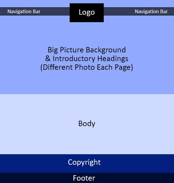
7) Big Picture Website Theme
The Big Picture Theme is popular with those that don't want to take a lot of space for their branding (logo & header image at top of website) and also want an image to anchor each page that will fill the top of the page behind the navigation. Typically, the main page title for each page overprints the page background image (which is often exaggerated with a dark filter and the text on top is white.
Logo Size
Minimum of 200px x 166px (If larger logo then the ratio must be the same)
Unique Functions
All pages have a banner image in page heading element.
The page header element of the index page (your first page) has extra details like subtitle, link and you may add up to 10 images for the home page slider.
Required: the page heading element (first option in toolbox) MUST ALWAYS be the first element on the page.
Body of Pages
Unique to this theme, after the page heading, you must add a start section element, then add your page body elements and then a close section element at the end of each page.
Menu Function
The main tabs will alternate left, then right to balance the top of the site. Having an equal number of main navigational tabs is advised for the best aesthetics.
Not Supported
The home page slider is not supported.
These area widgets: left, right, above header and into header are not supported.
The menu separator (style settings), menu shadow, and breadcrumbs are not supported.
CUSTOMIZATIONS: Easily change theme images, colors, backgrounds and more ...
Tap here to see theme #7 in action.
(1) Standard | (2) Minimal | Mobile First | (4) One Screen | (5) Solo Page | (6) Advance | (7) Big Picture | (8) Big Idea | (9) Custom Head | (10) Standard/Sections | (11) Custom Head 2 | (12) Big Picture Minimalist
8) Our Big Idea Website Theme
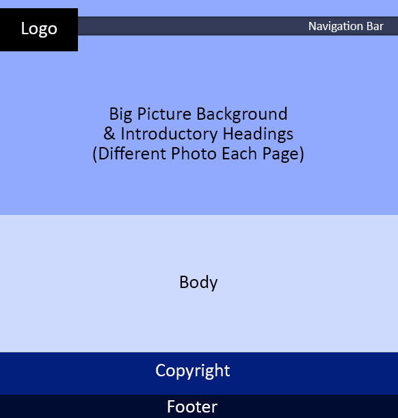
8) Big Idea Website Theme
The Big Picture Theme is popular with those that don't want to take a lot of space for their branding (logo & header image at top of website) and also want an image to anchor each page that will fill the top of the page behind the navigation. Typically, the main page title for each page overprints the page background image (which is often exaggerated with a dark filter and the text on top is white.
Logo Size
Minimum of 200px x 166px (If larger logo then the ratio must be the same)
Unique Functions
All pages have a banner image in page heading element.
The page header element of the index page (your first page) has extra details like subtitle, link and you may add up to 10 images for the home page slider.
Required: the page heading element (first option in toolbox) MUST ALWAYS be the first element on the page.
Body of Pages
Unique to this theme, after the page heading, you must add a start section element, then add your page body elements and then a close section element at the end of each page.
Menu Function
The main tabs will alternate left, then right to balance the top of the site. Having an equal number of main navigational tabs is advised for the best aesthetics.
Not Supported
The home page slider is not supported.
These area widgets: left, right, above header and into header are not supported.
The menu separator (style settings), menu shadow, and breadcrumbs are not supported.
CUSTOMIZATIONS: Easily change theme images, colors, backgrounds and more ...
Tap here to see theme #8 in action.
(1) Standard | (2) Minimal | Mobile First | (4) One Screen | (5) Solo Page | (6) Advance | (7) Big Picture | (8) Big Idea | (9) Custom Head | (10) Standard/Sections | (11) Custom Head 2 | (12) Big Picture Minimalist
(1) Standard | (2) Minimal | Mobile First | (4) One Screen | (5) Solo Page | (6) Advance | (7) Big Picture | (8) Big Idea | (9) Custom Head | (10) Standard/Sections | (11) Custom Head 2 | (12) Big Picture Minimalist
9) Our Custom Head Website Theme
(1) Standard | (2) Minimal | Mobile First | (4) One Screen | (5) Solo Page | (6) Advance | (7) Big Picture | (8) Big Idea | (9) Custom Head | (10) Standard/Sections | (11) Custom Head 2 | (12) Big Picture Minimalist
10) Our Standard with Sections Website Theme
(1) Standard | (2) Minimal | Mobile First | (4) One Screen | (5) Solo Page | (6) Advance | (7) Big Picture | (8) Big Idea | (9) Custom Head | (10) Standard/Sections | (11) Custom Head 2 | (12) Big Picture Minimalist
11) Our Custom Head 2 Website Theme
(1) Standard | (2) Minimal | Mobile First | (4) One Screen | (5) Solo Page | (6) Advance | (7) Big Picture | (8) Big Idea | (9) Custom Head | (10) Standard/Sections | (11) Custom Head 2 | (12) Big Picture Minimalist


 Follow


